Full rebrand and custom site and tooling for an established engineering firm
LEI's site had aged out: invisible to search, invisible to AI, and hiding thirty years of serious engineering work. We updated their website, modernized their logo, designed a 30-year anniversary mark, and delivered a brand usage guide to keep everything consistent going forward.
LEI's existing site undersold the range and quality of what they do. The redesign restructured the content to clearly communicate their full service offering, making it easy for prospective clients to understand what LEI brings to a project. The layout is clean and direct: strong photography, clear calls to action, and a structure that scales as they add new service lines or project highlights.
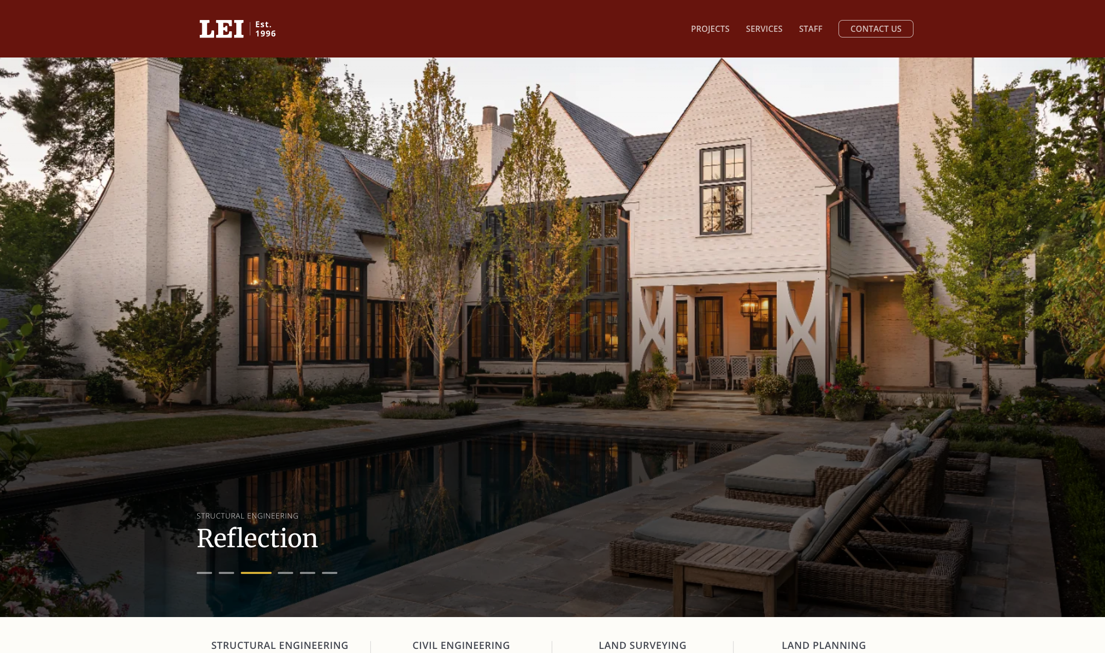
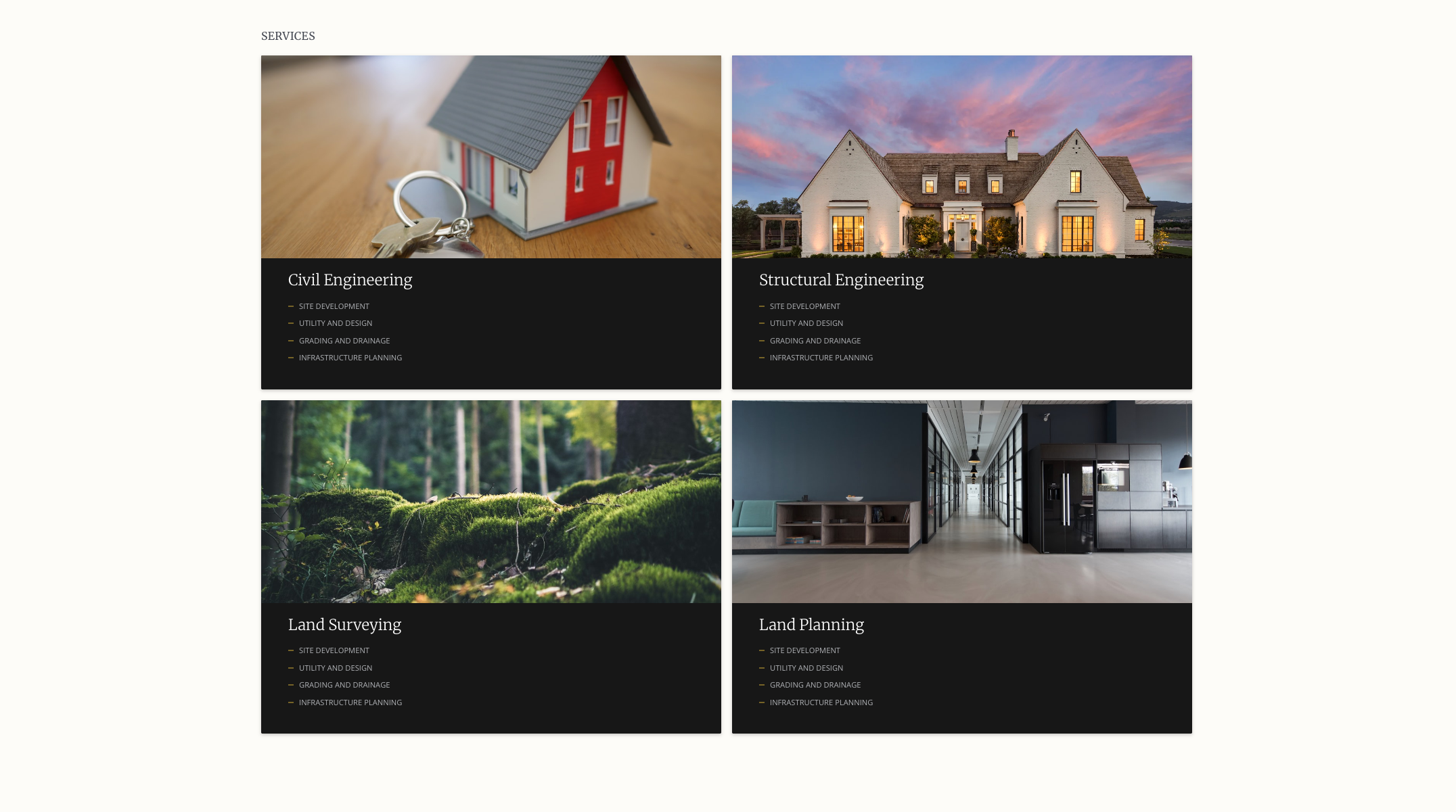
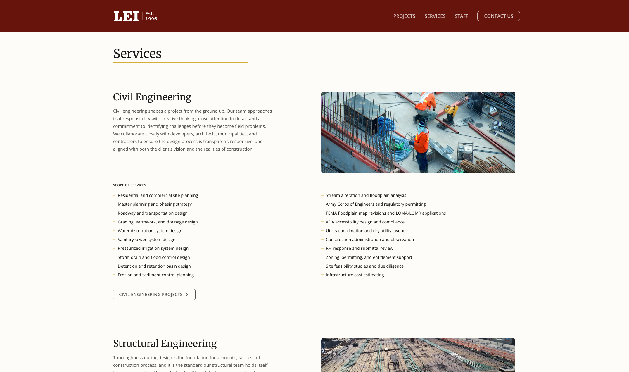
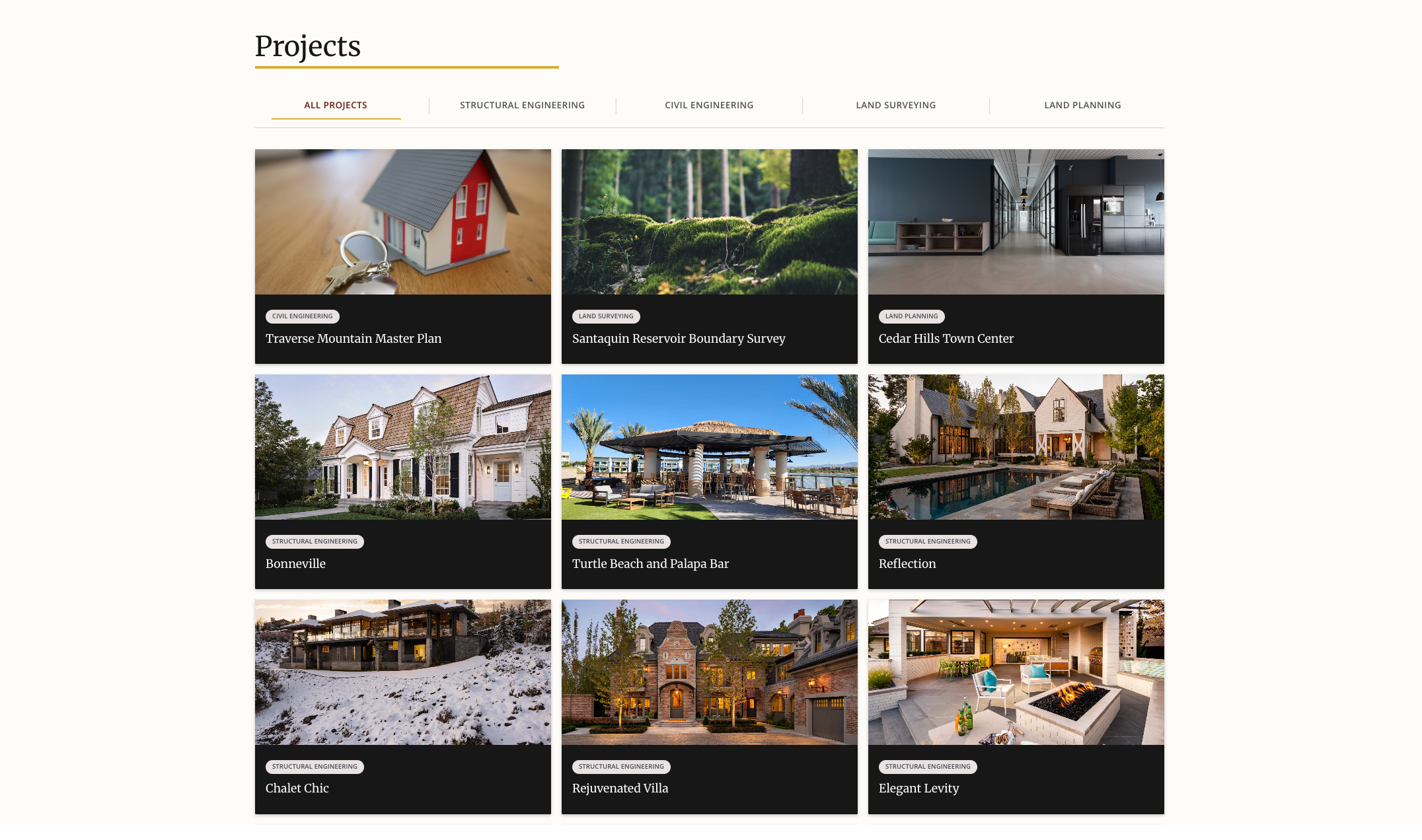
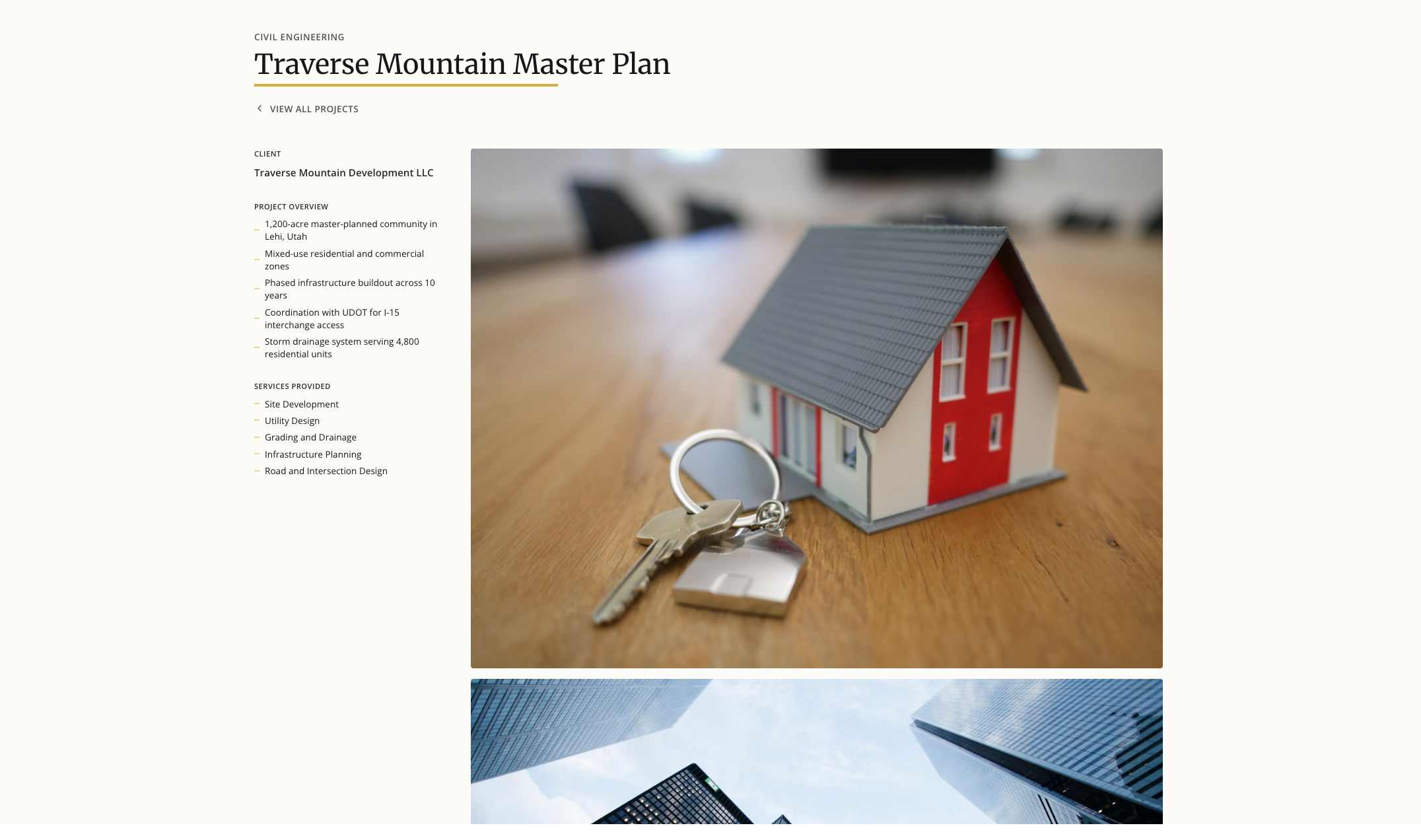
LEI produces an enormous quantity of work, decades of projects across four disciplines, and on the old site there was no good way to get at it. Visitors needed a lightweight way to browse everything and filter straight to the type of project they came to see, whether that's structural, civil, surveying, or land planning. Every project page carries the client, an overview, and the services provided, so the work speaks in specifics.
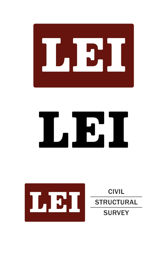
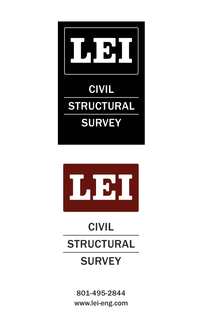
The original LEI mark had served the company well, but after 30 years it needed a refresh. We modernized the logo for better readability and versatility across digital and print, creating horizontal and vertical lockups that work at any size. The new mark keeps the equity of the original while feeling sharper and more intentional.
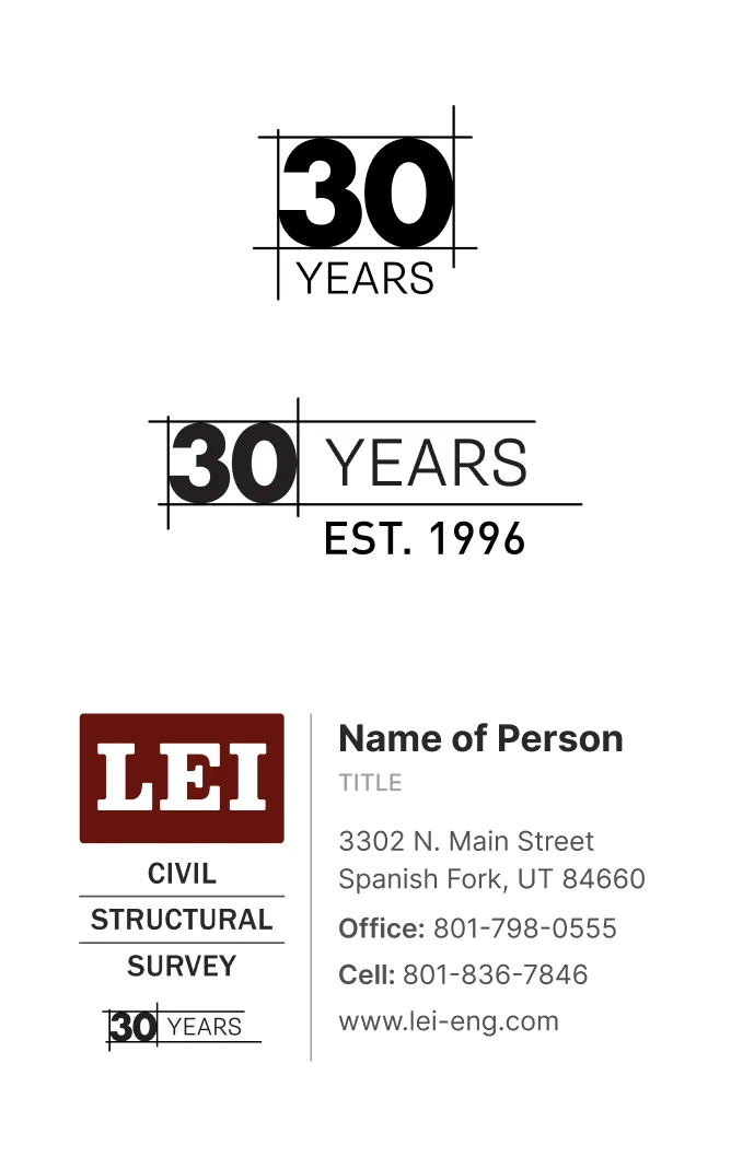
To celebrate three decades in business, LEI wanted a special mark they could use across materials for the anniversary year. We designed a commemorative badge whose linework draws on architectural diagrams, the drafted lines and measured geometry of the documents LEI produces every day, so the mark celebrates the milestone in the firm's own visual language. It pairs with the primary logo and works on everything from letterhead to event signage.
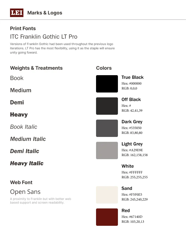
With a new logo and refreshed look, LEI needed a reference to keep future work consistent. We delivered a brand usage guide covering logo application, typography, color palette, and usage rules, giving their team and vendors a single source of truth for the brand going forward.
This relationship started as a website redesign. As we worked together, LEI saw the potential in updating their logo while the brand was already on the table, and that rolled into stationery, an anniversary mark, and a full set of guidelines. Good problems to have, but every addition reshaped the plan.
Prioritization became a constant part of our conversations: what LEI needed first, what could wait, and what order made each piece useful the day it arrived. All work is good work. Delivering it in the order the client actually needs is what makes it useful to them.
Need a brand that reflects the quality of your work? Let's talk.